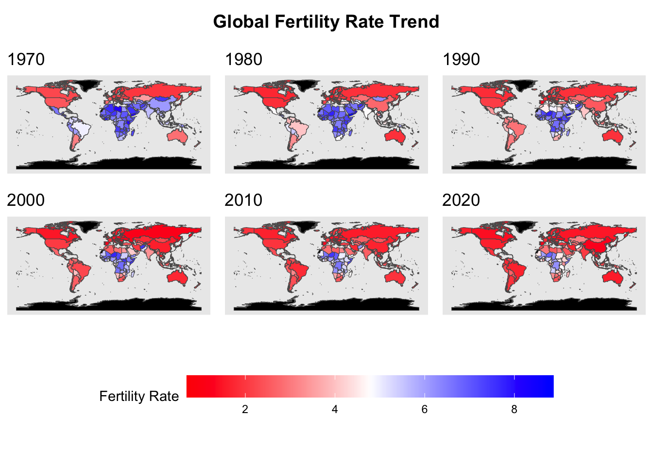
This visualization above illustrates the global trend of fertility rate from 1970 to 2020. It appears that regions with higher fertility rates (colored in blue) have diminished over the decades. On the other hand, areas with a lower fertility rate (colored in red) have increased significantly over the decades, expanding across Europe, the Americas, and parts of Asia. This trend reflects a global shift toward a lower fertility rate, which might be driven by improvements in education, healthcare, and economics.
The shape file used to make this graph is obtained from the link shown below: https://www.geoboundaries.org/globalDownloads.html
3.2 How Fertility Rates and GDP Growth Have Evolved Globally Over Time
Code
gdp <-read_csv("data_clean/gdp_long.csv", show_col_types =FALSE)
ggplot(scaled_gdp, aes(x = Year)) +geom_line(aes(y = mean_fertility, color ="Fertility Rate")) +geom_line(aes(y = mean_gdp, color ="GDP Growth")) +scale_color_manual(values =c("Fertility Rate"="blue","GDP Growth"="red")) +labs(title ="Global Trends in Fertility Rate and GDP Growth Rate Over Time",x ="Year",y ="Scaled Values (0-1)",color ="Variables of Interest" ) +theme_minimal()
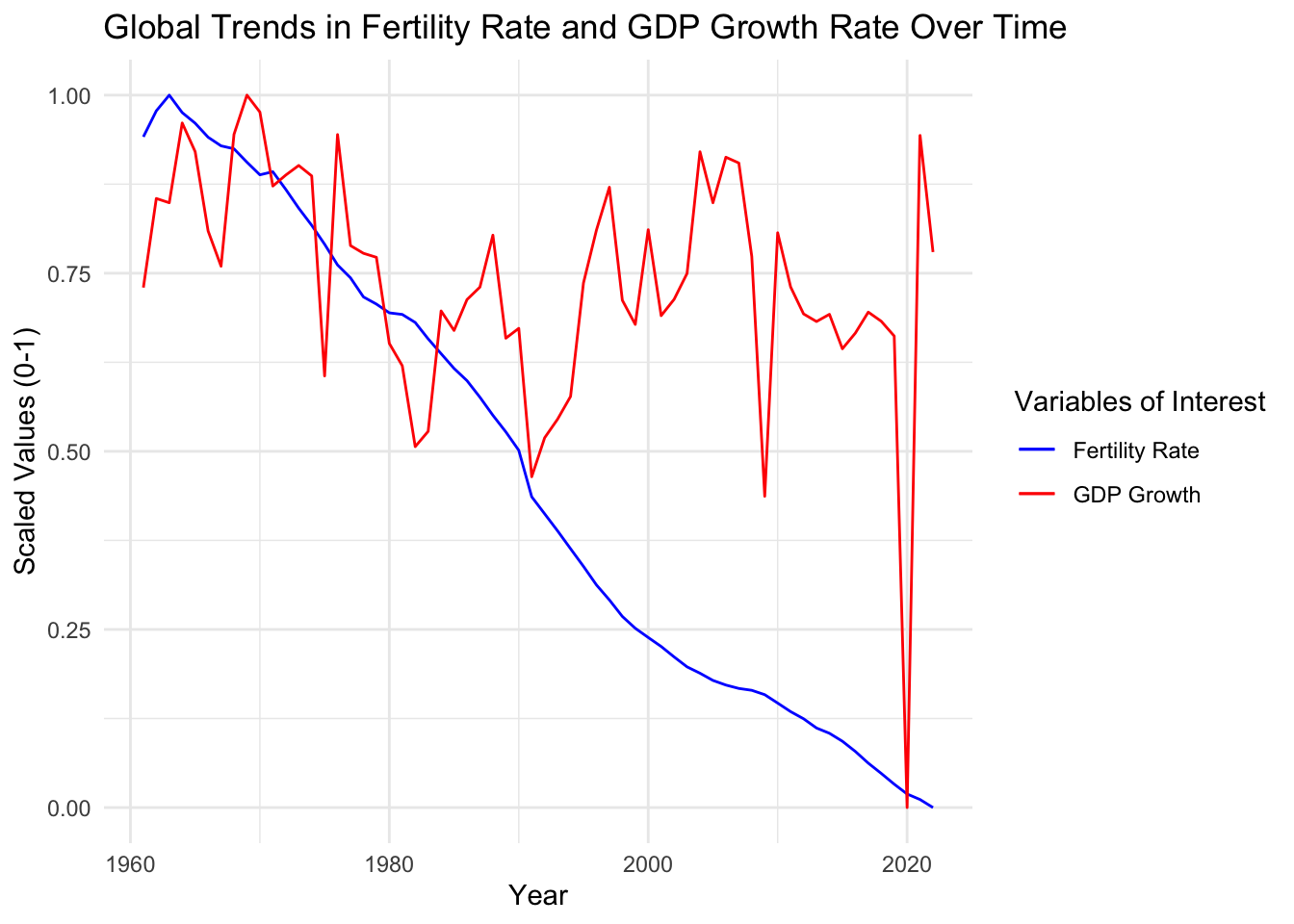
This graph highlights the relationship between the average fertility rates (blue line) and the average GDP growth rate (red line) across the globe from 1960 to 2020. The y-axis displays the scaled value for these two variables because of the differences in their measuring units. Over the decades, fertility rates have shown a consistent declining trend. On the other hand, GDP growth has fluctuated over the years, revealing periods of economic growth and recessions, with two noticeable drops around 2010 and 2020, when global crises like the Great Recession and the COVID-19 pandemic happened. The steady decline in fertility rates with the fluctuation shown in GDP growth rate indicates that the changes in fertility rate are independent of the variations in the country’s economic health.
3.3 Fertility Rate Density Plot by High vs Low GDP Countries
marriage_divorce <- marriage_data |>left_join(divorce_data, by =c("Entity", "Code", "Year")) names(marriage_divorce)[1] <-"Country"names(marriage_divorce)[4] <-"MarriageRate"names(marriage_divorce)[5] <-"DivorceRate"filtered_education <- education_data |>filter(Country %in% marriage_divorce$Country & Year %in% marriage_divorce$Year)filtered_fertility <- fertility_data |>filter(Country %in% marriage_divorce$Country & Year %in% marriage_divorce$Year)filtered_gdp <- gdp_data |>filter(Country %in% marriage_divorce$Country & Year %in% marriage_divorce$Year)filtered_life <- life_data |>filter(Country %in% marriage_divorce$Country & Year %in% marriage_divorce$Year)final_data <- marriage_divorce |>left_join(filtered_education, by =c("Country", "Code", "Year")) |>left_join(filtered_fertility, by =c("Country", "Code", "Year")) |>left_join(filtered_gdp, by =c("Country", "Code", "Year")) |>left_join(filtered_life, by =c("Country", "Code", "Year"))##colSums(is.na(final_data))
Code
final_data <- final_data |>filter(!is.na(gdp_growth) &!is.na(fertility_rate)) |>mutate(GDP_Group =ifelse(gdp_growth >=median(gdp_growth, na.rm =TRUE), "High GDP", "Low GDP") )ggplot(final_data, aes(x = fertility_rate, fill = GDP_Group)) +geom_density(alpha =0.6) +# Semi-transparent fill for overlapping areaslabs(title ="Fertility Rate Distribution: High vs. Low GDP Countries",x ="Fertility Rate",y ="Density",fill ="GDP Group" ) +scale_fill_manual(values =c("High GDP"="blue", "Low GDP"="red")) +theme_minimal() +theme(plot.title =element_text(hjust =0.5, face ="bold"),axis.text =element_text(size =10) )
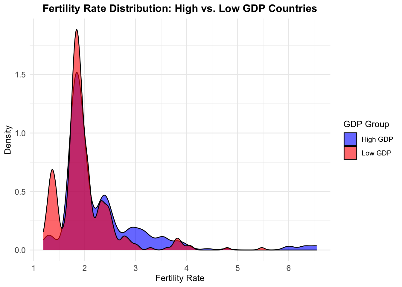
The density plot compares fertility rates between high and low GDP countries, with both groups showing a primary peak in the 1.5-2.5 range, though low GDP countries have slightly higher density there. Low GDP countries display a unique secondary peak around 1.2-1.3 that isn’t seen in high GDP countries. High GDP countries show more spread in the 2.5-3.5 fertility rate range. Both distributions have long but sparse tails extending toward higher fertility rates. While there is significant overlap between the groups, the distributions reveal distinct fertility patterns associated with economic development levels.
3.4 The Relationship Between Education Levels and Fertility Rates
Code
education <-read_csv("data_clean/education_long.csv", show_col_types =FALSE)code <-unique(marriage_rate$Code)education_country <- education |>filter(Code %in% code)fertility_country <- fertility_rate |>filter(Code %in% code)education_clean <-na.omit(education_country)education_clean <- education_clean |>filter(Year %in%c(2014:2022))edu_fertility <-left_join(education_clean, fertility_country, by =c("Code", "Year", "Country"))row <-which(edu_fertility$education_level =="Doctoral or equivalent")edu_fertility <- edu_fertility[-row,]edu_fertility$education_level <-as.factor(edu_fertility$education_level)## Removed Peru because of the lack of datarow <-which(edu_fertility$Country =="Peru")edu_fertility <- edu_fertility[-row,]
ggplot(scaled_data, aes(x = Year)) +# Bar plot for educational attainment percentagesgeom_bar(aes(y = percentage, fill ="Bachelor's Degree or Higher"),stat ="identity") +# Line plot for fertility rategeom_line(aes(y = fertility_rate, group = Country, color ="Fertility Rate")) +scale_x_continuous(breaks =seq(2014, 2022, by =2)) +scale_y_continuous(breaks =c(0,0.5,1), ) +scale_fill_manual(name ="Bar", values =c("Bachelor's Degree or Higher"="lightblue") ) +scale_color_manual(name ="Line",values =c("Fertility Rate"="black") ) +facet_wrap(~Country) +labs(title ="Educational Attainment and Fertility Rate by Country",x ="Year", y ="Scaled Educational Attainment and Fertility Rate (0-1)" ) +theme(axis.text.x =element_text(angle =45, hjust =1),legend.position ="bottom",panel.grid.minor =element_blank())
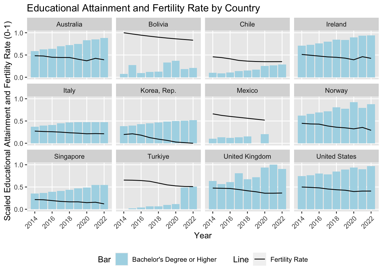
The graph explores the relationship between fertility rates and educational attainment, represented by the black lines and blue bars, respectively. The values displayed on the y-axis are scaled to ensure comparability. The countries shown in the graph are chosen from multiple continents, including Europe, the Americas, and Asia-Pacific, to offer a global insight into trends. For these countries, the visualization demonstrates that fertility rates decrease as educational attainment increases from 2014 to 2022. This finding suggests that the global decrease in fertility rate might be associated with the elevation in education levels in recent years.
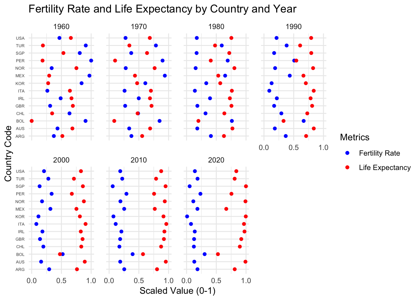
3.5 Tracking Fertility Rate and Life Expectancy Trends Across Decades
ggplot(scaled_life_10, aes(y = Code)) +geom_point(aes(x = fertility_rate, color ="Fertility Rate")) +geom_point(aes(x = life_expectancy, color ="Life Expectancy")) +facet_wrap(~Year, ncol =4) +scale_color_manual(name ="Metrics",values =c("Fertility Rate"="blue", "Life Expectancy"="red") ) +scale_x_continuous(breaks =seq(0, 1, by =0.5)) +labs(title ="Fertility Rate and Life Expectancy by Country and Year",x ="Scaled Value (0-1)",y ="Country Code",color ="Metric" ) +theme_minimal() +theme(axis.text.y =element_text(size =5),legend.position ="right",panel.spacing =unit(1, "lines") )
This visualization shows the changes in fertility rates (blue dots) and life expectancy (red dots) for various countries from 1960 to 2020. The values are scaled for comparion. Countries included in this graph is the same as the last one except for the addition of Peru, which is absent from the previous graph due to the lack of data. The graph displays a steadily increasing trend for life expectancy as fertility rates decrease over the years. Despite the regional differences in the changing rate, the opposing pattern shown in the graph suggests that improvement in healthcare might be negatively associated with the fertility rate.
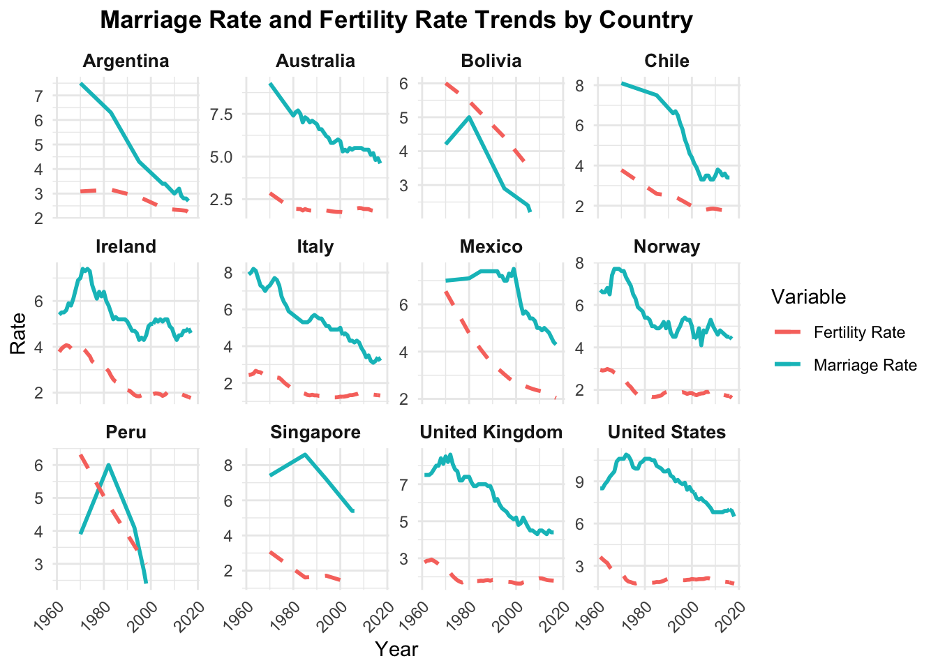
3.6 The Relationship between Marriage Rate and Fertility Rate
Code
filtered_data <- final_data %>%filter(!is.na(MarriageRate) &!is.na(fertility_rate))# Line plotggplot(filtered_data, aes(x = Year)) +geom_line(aes(y = MarriageRate, color ="Marriage Rate"), size =1) +geom_line(aes(y = fertility_rate, color ="Fertility Rate"), size =1, linetype ="dashed") +facet_wrap(~ Country, scales ="free_y") +labs(title ="Marriage Rate and Fertility Rate Trends by Country",x ="Year",y ="Rate",color ="Variable" ) +theme_minimal() +theme(plot.title =element_text(hjust =0.5, face ="bold"),axis.text.x =element_text(angle =45, hjust =1),strip.text =element_text(size =10, face ="bold") )
Marriage rates have declined gradually in several countries including Argentina, Australia, Bolivia, Mexico, Peru, Singapore and Chile, while showing fluctuations before declining in Ireland and the United Kingdom. Countries like Mexico and Peru initially had high fertility rates followed by sharp decreases, while Norway and Singapore saw smaller declines in both fertility and marriage rates. Marriage rates have generally remained more stable than fertility rates across many countries. Some nations like Singapore and the United States show clear trends with marriage rates stabilizing at lower levels. Both marriage and fertility rates demonstrate an overall downward trend, with some countries like Ireland and the United Kingdom showing correlation between the two measures.
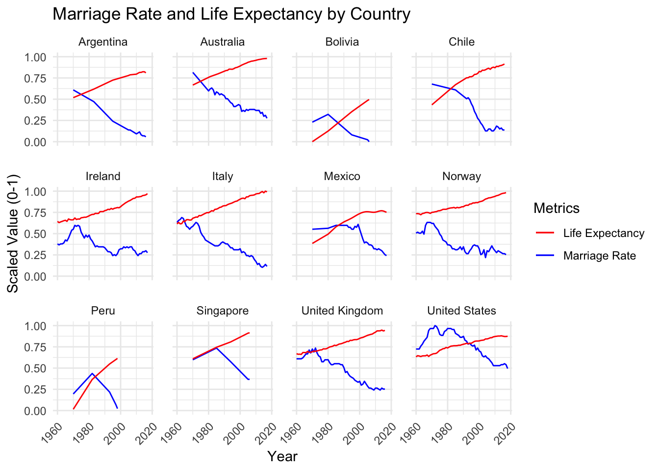
3.7 Marriage and Longevity: Rising Life Expectancy, Declining Marriage Rates
ggplot(life_marriage_scaled, aes(x = Year)) +geom_line(aes(y = marriage_rate, color ="Marriage Rate")) +geom_line(aes(y = life_expectancy, color ="Life Expectancy")) +facet_wrap(~Country) +scale_color_manual(name ="Metrics",values =c("Marriage Rate"="blue", "Life Expectancy"="red") ) +labs(title ="Marriage Rate and Life Expectancy by Country",x ="Year",y ="Scaled Value (0-1)" ) +theme_minimal() +theme(axis.text.x =element_text(angle =45, hjust =1),panel.spacing =unit(1, "lines"))
This graph provides a further investigation on the previous exploration of fertility and marriage rates. Since in previous exploration, we found a negative association between life expectancy and fertility rate, this graph is made to examine the relationship between marriage rates and life expectancy from 1960 to 2020. The values of both variables are scaled to avoid bias in comparison. While the visualization exhibits a steady trend of increasing life expectancy, marriage rates have been consistently decreasing across the years. Despite the rate and the extent of changes vary by country, the overall trend is shared globally, which could be one of the factors influencing family structures and leading to changes in the fertility rate.
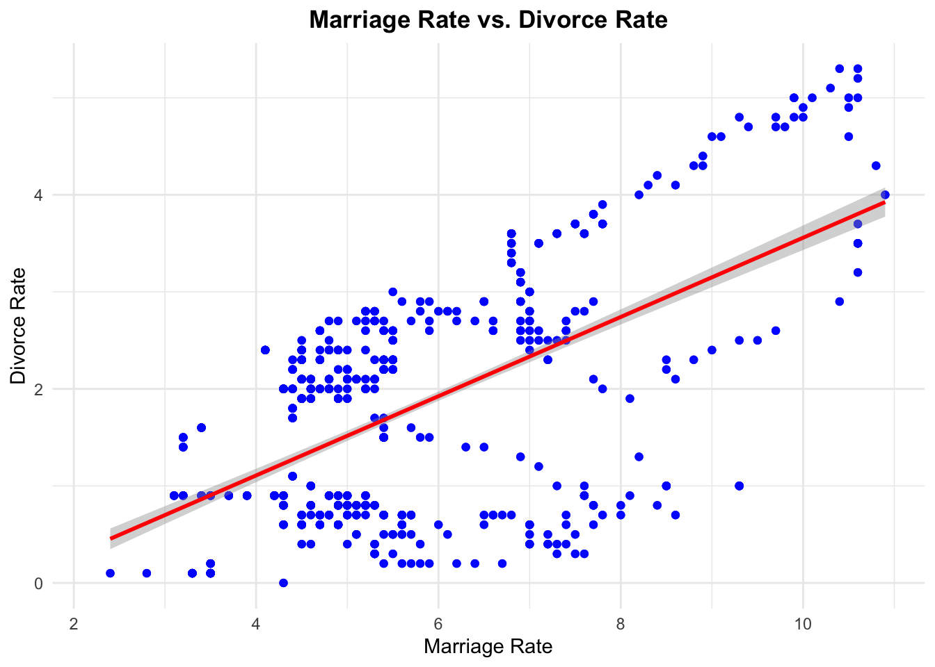
3.8 The Relationship between Marriage Rate and Divorce Rate
Code
ggplot(final_data, aes(x = MarriageRate, y = DivorceRate)) +geom_point(alpha =0.7, color ="blue") +geom_smooth(method ="lm", color ="red", se =TRUE) +labs(title ="Marriage Rate vs. Divorce Rate",x ="Marriage Rate",y ="Divorce Rate" ) +theme_minimal() +theme(plot.title =element_text(hjust =0.5, face ="bold") )
`geom_smooth()` using formula = 'y ~ x'
The scatterplot illustrates the relationship between marriage rates (x-axis) and divorce rates (y-axis), with each blue dot representing a data point and a red trend line showing a positive correlation. Marriage rates span from 2 to 10, while divorce rates range from 0 to 5, with the data points showing notable spread around the trend line. There’s greater variability in divorce rates when marriage rates are between 4-6, creating a wider band of points in this region. At higher marriage rates (8-10), the points align more closely with the trend line, though some outliers exist. The relationship suggests that while higher marriage rates generally correspond to higher divorce rates, the correlation isn’t perfect, particularly at the extremes of the marriage rate range.
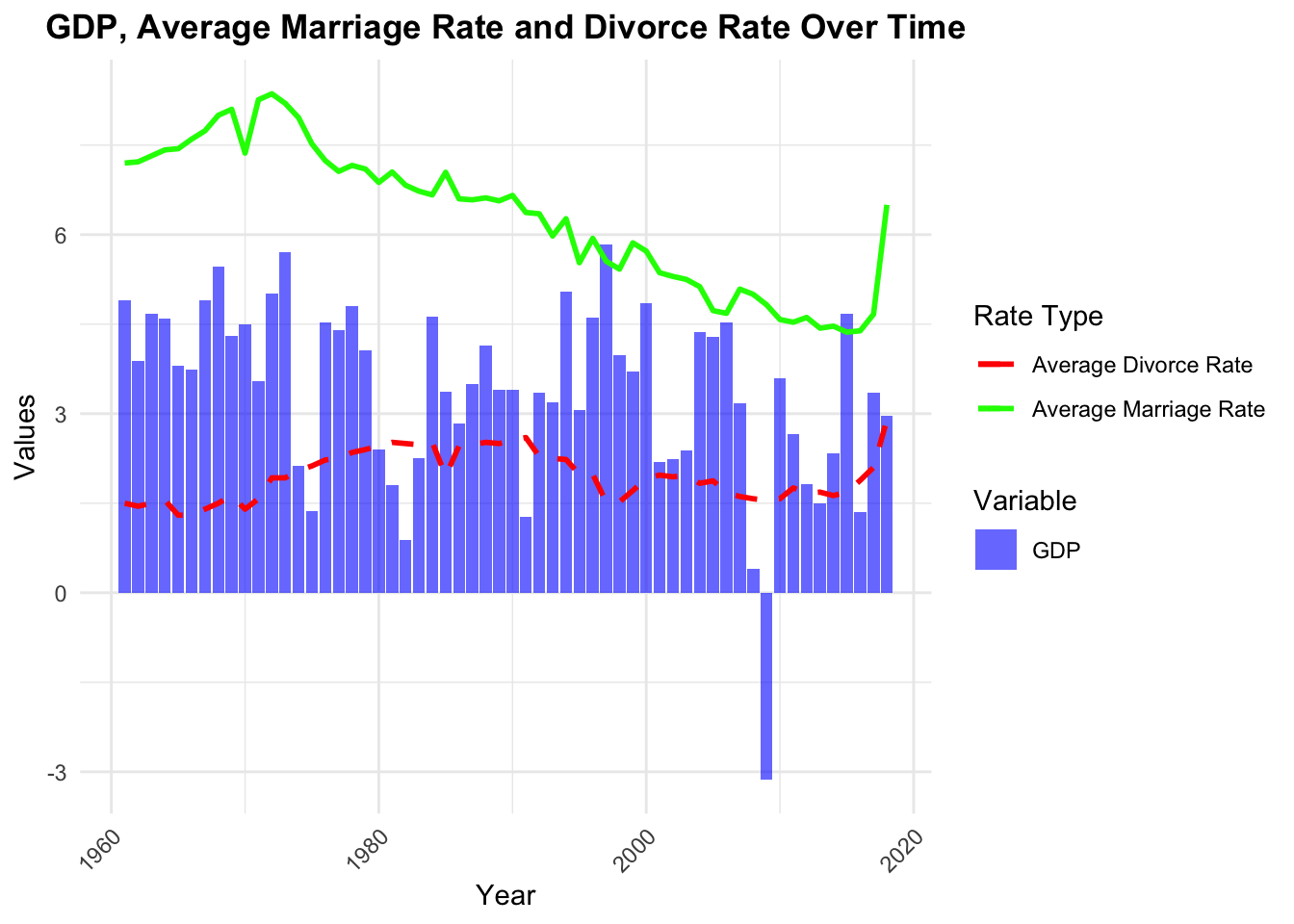
3.9 Global Trend Focusing on GDP, Marriage Rate and Divorce Rate
Code
plot_data <- final_data %>%group_by(Year) %>%summarize(Avg_MarriageRate =mean(MarriageRate, na.rm =TRUE),Avg_DivorceRate =mean(DivorceRate, na.rm =TRUE),Avg_GDP =mean(gdp_growth, na.rm =TRUE) ) %>%ungroup()ggplot(plot_data) +geom_bar(aes(x = Year, y = Avg_GDP, fill ="GDP"), stat ="identity", alpha =0.6) +geom_line(aes(x = Year, y = Avg_MarriageRate, color ="Average Marriage Rate"), size =1) +geom_line(aes(x = Year, y = Avg_DivorceRate, color ="Average Divorce Rate"), size =1, linetype ="dashed") +labs(title ="GDP, Average Marriage Rate and Divorce Rate Over Time",x ="Year",y ="Values",fill ="Variable",color ="Rate Type" ) +theme_minimal() +theme(plot.title =element_text(hjust =0.5, face ="bold"),axis.text.x =element_text(angle =45, hjust =1) ) +scale_fill_manual(values =c("GDP"="blue")) +scale_color_manual(values =c("Average Marriage Rate"="green","Average Divorce Rate"="red" ))
This graph illustrates the relationship between GDP, marriage rates, and divorce rates from 1960 to 2020. The marriage rate (green line) shows a clear downward trend over the 60-year period, declining from around 7 to 5, though it spikes sharply upward near 2020. The divorce rate (red dashed line) remains relatively stable between 2-3 throughout the period, showing only minor fluctuations. GDP (blue bars) demonstrates considerable volatility, fluctuating mostly between 0 and 6, with a dramatic drop to negative values around 2015 before recovering. Notably, despite these significant changes in marriage rates and GDP, the divorce rate maintains remarkable stability over the entire period.
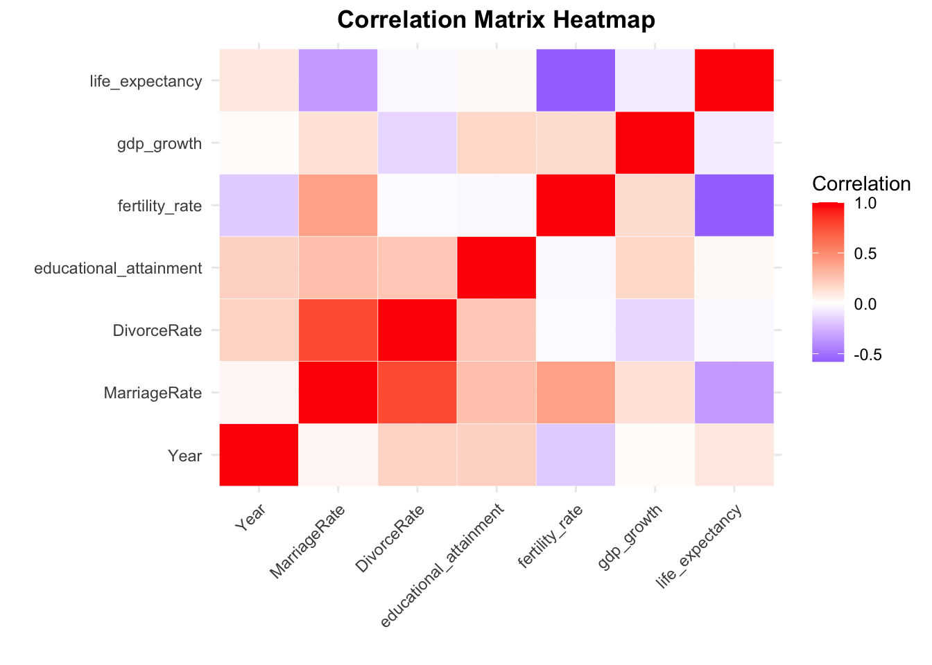
3.10 Correlation Matrix Display The Relationships between Every Pairwise Combination of Numeric Variables
The correlation matrix heatmap reveals a strong positive correlation between Marriage Rate and Divorce Rate, as well as between Marriage Rate and fertility rate. Fertility rate shows a negative correlation with Year, reflecting the global trend of decreasing fertility rates over time. There’s an unexpected negative correlation between fertility rate and life expectancy. GDP growth shows weak correlations with most variables, indicating it may be less connected to demographic trends in this dataset.